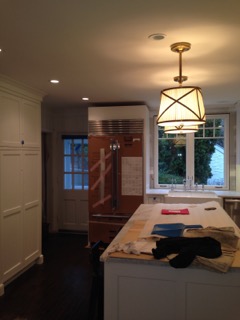
For the final post of our “Work In Progress” series, which provides a look at the design process behind our work on a young family’s new home, I’m happy to share candid shots a few days into the final installations. Finishing touches on the kitchen were being added, built-ins were getting their final tweaks, paint was drying, wallpaper was going up, and some of the key furniture was placed in the rooms.
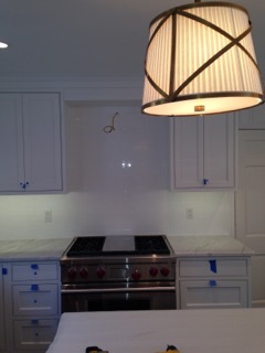
The kitchen is more modern, but still rooted in traditional references like shaker style cabinet doors, carrara marle countertop, and bridge sink faucet. This kitchen is lighter, brighter, and significantly more family and entertaining friendly than it’s original iteration.
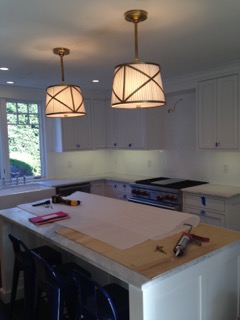
We enlarged a window not only to bring in tons of natural light, but also to give our client a lovely view into their backyard, pool, and pool house – a great vista from which to watch kids playing and friends lounging while prepping meals.

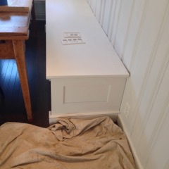
We created a breakfast area with a custom built-in bench for the family to gather for everyday meals. Custom valances top off the look.

Whenever possible we like to incorporate client’s existing furniture into their new spaces – here we used an antique farm table our client inherited and paired it with blue French metal chairs.

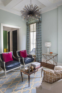
The living room combines fun fabrics from Lulu DK and Serena and Lily with a more classic, traditional Chesterfield sofa from Lee Industries. The wing chairs are vintage, but spruced up with new fabric and fresh paint. We also re-worked the vintage cane chairs that sit opposite the sofa. A vintage lucite table, animal skin rug, vintage green side tables, and a large, simple sisal area rug round out the key elements in this room. All it needs now is a little art, a few accessories and window treatments and they’ll be ready for their first cocktail party.


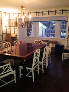
In the dining room, we added a really fun navy and white bamboo wallpaper, a simple window valance and chippendale style white chairs from Jonathan Adler. The table is from our client’s collection. A new chandelier and some other finishings touches will complete the room.
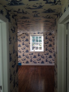
Here’s a closer look at the wallpaper we discussed in our second post about selecting color, furniture, and furnishings. We used custom colored paper from Galbraith and Paul in a newly created mudroom (formerly a long, narrow “closet” off the kitchen).

The powder room’s swanky sconces and splatter paint wallpaper await a mirror to finish off that room.

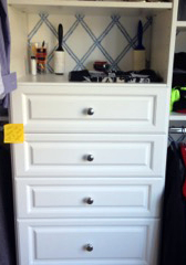
Here’s the master bedroom coming together. We paired D. Porthault linens with a headboard from Pottery Barn, vintage creme colored nightstands, and bench that already was part of our client’s collection. We also had a custom skirted dressing table made for this same room.


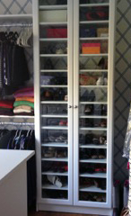
The master closet includes custom built-ins to maximize the space. You’ll see that we echoed the blue and white pattern seen throughout the house with wallpaper by Thibaut.
In the guest room we papered the walls and ceiling with a beautiful chinoiserie print by Osborne & Little. This could be my favorite space yet. The paper really highlights all of this room’s slopped ceilings and architectural details.
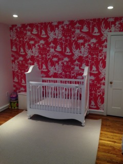
The nursery includes a similarly patterned wallpaper from Thibaut in a beautiful pink and white color. We topped off the look with pink paint on the other walls and custom window treatments in a white fabric with pink trim.
After months of meticulous planning, this home is really coming together! I hope you enjoyed getting a sneak peek of the process we go through when designing and renovating a home.
If you’re just tuning in, please check out the posts on construction and woodwork and color and furniture selection.
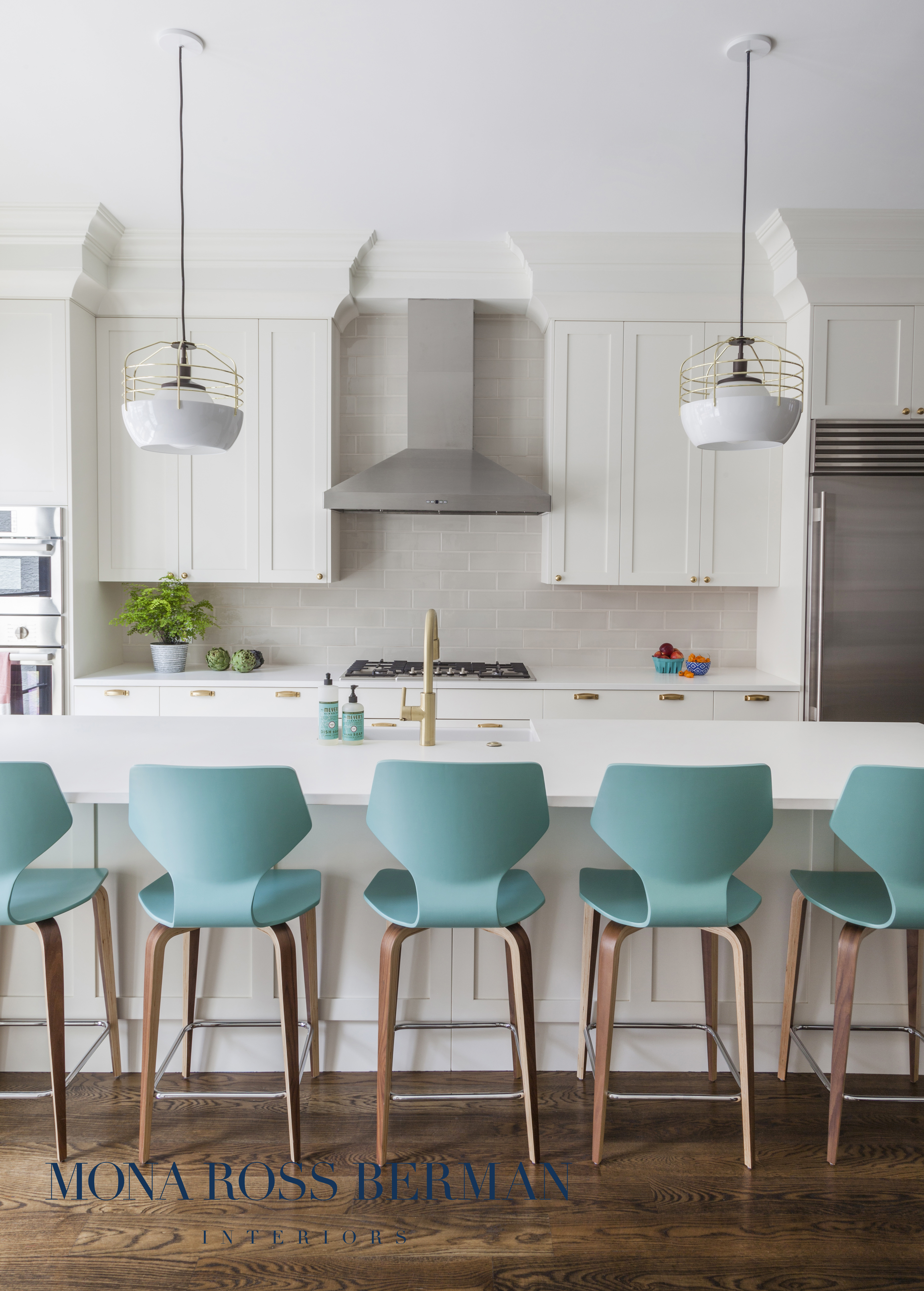
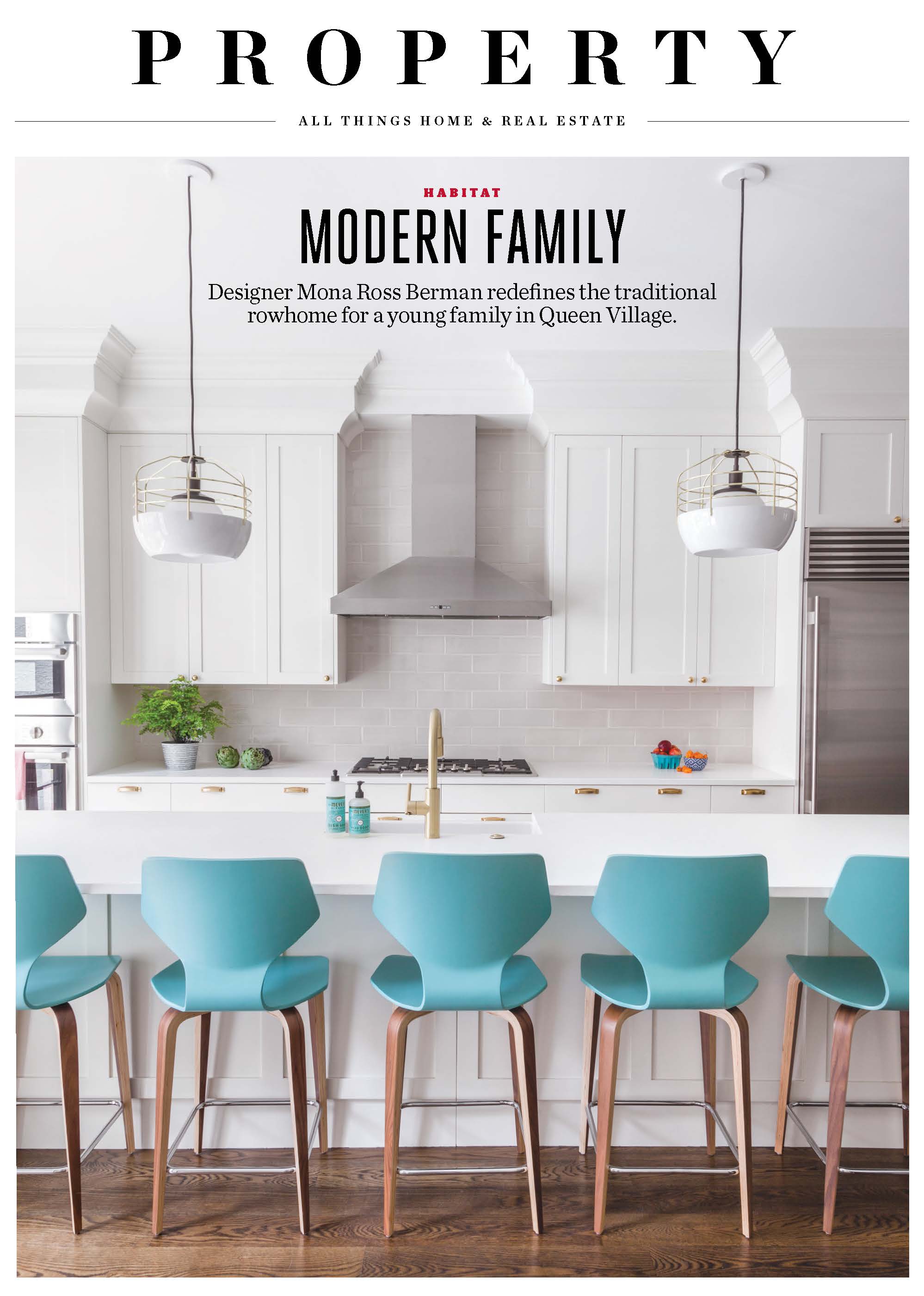
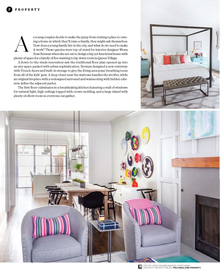
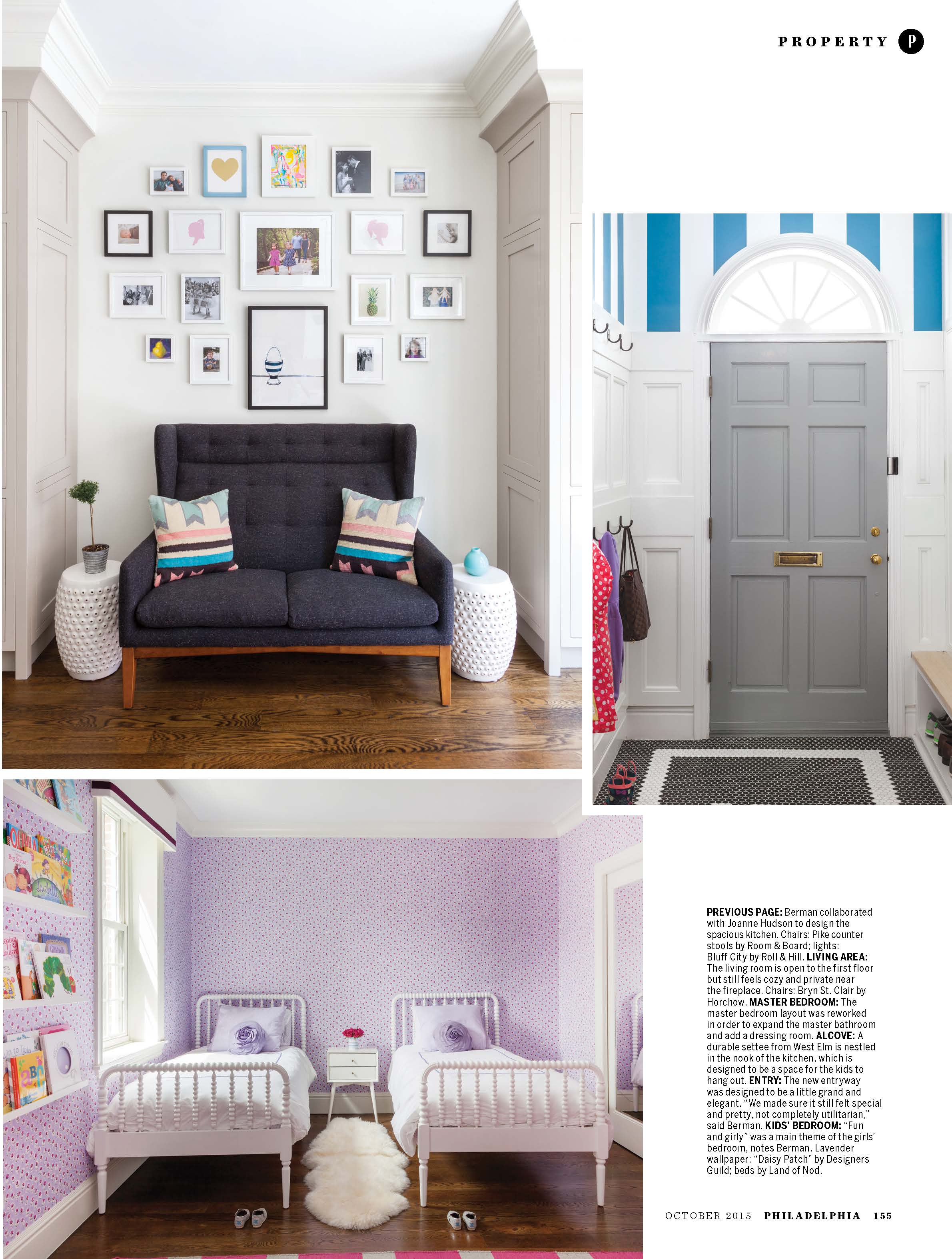
 Our design and complete interior renovation in Society Hill receives props in the April 2019 issue of Philadelphia Magazine. Dubbed “House Cool” by the magazine, this project involved stripping a traditional Philadelphia row home down to the studs to transform it into a fusion of fine craft, spirited whimsy, and continental sensibility. Pick up a copy of Philadelphia Magazine and check out this stunning project!
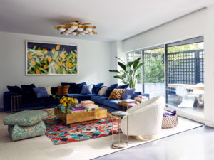
 Thanks, Main Line Today, for featuring our Gladwyne house design in your March 2019 edition! The project seamlessly unites an original structure built in the 1920’s with a large addition built 60 years later. Our design includes a blue and white palette to lighten and brighten the living spaces combined with interesting architectural elements like oversized wainscoting to complement the original details of the house. Read more about the project