We are in AD! Our renovation in Society Hill is featured in Architectural Digest’s Web-Exclusive Home Tour. Honored, humbled, thrilled. This gem of a project transforms a traditional Philadelphia row home into the modern ideal of urban living. What began as an office update turned into a full gut renovation, complete with a marble and brass single pivot front door that prepares guests for the design journey that lies within. Bespoke elements include a marble and brass partition wall, a unique glass and metal butler’s pantry/wine room, and an intricate brass and glass staircase that functions as both circulation space and a light well. See photos and AD’s write-up of the project here.
Jacobean Florals in 2015
Matouk’s The Thread blog featured Mona’s thoughts on using the traditional Jacobean floral style, which initially flourished in 17th century England, in a more modern way.
Mona shared that she loves using traditional patterns, like the Jacobean floral featured in this master bedroom, because they feel more fresh. “The liveliness and beauty of the color relationships make the design feel classic and chic rather than dowdy.”
Check out the complete “A Fresh Take on Jacobean Florals” at The Thread here.
Outfitting Your Guest Bedroom
Check Out Mona's Interview on Scratch!
Work in Progress | Phase Two: Selecting Color, Furniture, & Furnishings
I’m pleased to share the second post of our “Work In Progress” series, which provides a candid look at the design process behind our work on a young family’s new home. Our first post focused on the structural changes and millwork details mid-renovation. For part two of our series, I’m sharing details on the selection of color, furniture, and furnishings.
Planning and furnishing a room is like solving a puzzle. Each decision impacts the other decisions and everything is interconnected. As a designer, I need to constantly consider the minutia as well as the big picture. They are equally important – care and attention to both results in successful design. Typically, there’s a bit of a dance involved in creating a room scheme. I go back and forth in my own head, with my staff, and then with our client until we settle on the right combination. Here are some looks at rooms schemes for this project up close.
We previously discussed the new kitchen, which featured lots of bright white. White is an ideal backdrop of a kitchen or bathroom because it creates a neutral, timeless canvas upon which to build. As with this project, I typically try to keep the big investment and permanent decisions more classic and then add personality and individuality in details that are more easily changed as tastes shift and wear-and-tear take their toll. This kitchen / mudroom featured white cabinets and white 3×6 subway tile with pops of color and interest in the fabrics, wallpaper (from Galbraith & Paul), lighting, and other details.
The adjacent dining room continues the color theme, but in a slightly more sophisticated way. To warm-up the space, we added a custom campaign style buffet painted in Benjamin Moore’s Clover Green (see the shop drawing below). We adorned the server with vintage serving pieces and accessories sourced from Etsy. We covered the walls in a classic trellis wallpaper and added a simple, but dramatic valance in white and blue solid fabrics at the far end of the room. Jonathan Adler chairs and the client’s own dining table completed the look.
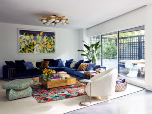
In the living room, I wanted to create a space that felt more grown-up and formal, but still fun and inviting. A vintage lucite coffee table, cowhide rug, and pillows with fabrics from Lulu DK helped set the tone. Vintage wing chairs re-worked and reupholstered in a Serena & Lily fabric provided a sophisticated look, as did a custom light blue Chesterfield sofa from Lee Industries. Two more vintage chairs were reupholstered in a classic dark navy and we added a vintage credenza to up the fun factor. The whole room was grounded by a large sisal area rug custom fit to the space.
One of my favorite ways to add color and character is with wallpaper. I’m a major fan of wallpaper, albeit with the caveat that it has the most impact in certain spaces and a limited number of times in any one project. That being said, we lined our client’s new “mini-mudroom” with this fantastic lattice wallpaper from Philadelphia’s own Galbraith & Paul (see below, top image). We lined the powder room – one of our favorite places to add paper – with Hinson & Co.’s Spatter in green (see below, bottom image).
And in the guest room, one of my favorite places to design because you can usually have a little more fun, we added another amazing wallpaper. A classic chinoiserie from Osborne & Little, this paper is both chic and whimsical. It was the starting point for the entire scheme that also included a rich blue velvet fabric on the bed.
The master bedroom and dressing room also got the blue and white treatment. The bedroom features amazing fabrics from Quadrille, a simple tufted white headboard from Pottery Barn, and linens from D. Portault and Leontine Linens. It’s a truly elegant and special space. To top it all off, the adjacent his and her dressing room is lined with fun blue and white lattice wallpaper that creates a pow of interest in an otherwise basic and utilitarian space.
Stay tuned for our final post with candid shots of the installation!
Work in Progress | Phase One: Structural, Architectural, & Room Layout Challenges
I’m delighted to launch a three-part series called “Work in Progress” that provides a sneak peek at a project mid-renovation. We design enthusiasts are often only privy to the end product of a renovation, but we all love seeing what things looked like not only before a project started, but also mid-way through. I wanted to share some candid images of a recent home renovation – from floor plans to construction and selection of furniture and furnishings.
Our client, a young family, bought their first home on Philadelphia’s tony “Main Line.” The house is a classic, mid-century, center-hall-colonial, with great bones and oodles of potential. It was previously owned by empty-nesters who had raised a family there. Our charge: update and ready it for 21st century living. We designed and implemented a top to bottom renovation of the house, including a complete gutting of the kitchen, the addition of a small but essential mudroom, and a large bank of built-ins in the family room.
We’ll start in the entry, which had an outdated door and minimal artificial (i.e. not “natural”/outdoor) lighting. We wanted to create a more dramatic and cheerful entrance.
We added faux wainscoting (which is much simpler and less costly than full wood paneling), painted the walls in super high gloss navy blue, and added more lighting to make this otherwise dark space feel bright, welcoming, and chic.
We also added a pop of red on the brand new front door, as well as beautiful new brass hardware
The kitchen posed a significant challenge. Of course, kitchens are always complex because they have to both look amazing and function optimally – particularly due to how most people live today. Function and form don’t always peacefully coexist, so I’m always working to ensure that both are considered carefully before we settle on a decision. I think we handled this delicate balance very well in this space and made the most of every opportunity we could find. Not a square inch was wasted, yet the kitchen doesn’t feel crowded or overworked.
Here are a couple of shots of the existing space – dated and dark with traditional wood cabinetry.
We decided to start anew with a gut renovation to open and brighten the space up and make it feel more connected to the other living spaces in the house. We knocked down a wall that separated the kitchen from what had been a library/den space. That really got the ball rolling and immediately changed the entire character of the kitchen.
Here’s a view of the main kitchen area during renovation. The cabinets are custom (handmade right here in PA), the countertops are honed marble carrara (note the amazing slab of honed marble on the large island), and the appliances are top of the line – Miele, Sub-Zero, and Wolf.
Wherever possible, we took cabinetry to the ceiling and added a simple crown moulding to help elevate the room and make it feel even more spacious. We also added recessed lighting which always makes a huge difference in how a room feels and in a kitchen is essential for functionality.
To keep things classic and simple, we used 3×6 white subway tile for the backsplash. It’s a classic look, available at almost every price point.
While the size of the kitchen did not allow for a traditional walk-in pantry, we added a large custom pantry cabinet with plenty of room to store all of our client’s dry goods and other cooking essentials.
In the main living areas of the house, our primary challenge was the space between the family and living rooms. The family room had to function as the family’s main hang-out space and their daughter’s playroom. I wanted the living room to feel a bit more separate and formal and for the adjacent family room to feel cozy with it’s own character. The previous homeowners installed heavy drapes between these two rooms, but the rooms were still very open to one another.
We decided to make the opening between the two rooms smaller and add pocket doors so the owner’s could close off the spaces entirely for entertaining or containment of curious “wee” ones. We also created a deep, paneled “mini-hallway” between the two rooms to give the transition a sense of grandeur and architectural interest and integrity. I think the new doorway looks as if it’s always been there – it’s still much larger than the average doorway, but not so much so that the two rooms bleed entirely into one another.
In the family room we added custom wall to wall custom built-ins which allow for maximum storage and functionality. They also are versatile enough to carry the family through many years. While the cabinets currently house baby toys, they will easily transition to a space for board games and school books. It’s important to design-forward and think about what the next 5,10,15 years plus of a family’s life will be like in a space. Ideally, the rooms I design will hold up so only tweaks are required rather than complete overhauls as children grow and lives change.
Stay tuned for our next post! We’ll share details on the process behind selecting the furniture and furnishings.
Top Decor Trends in 2015
As we head into the new year, Mona recently shared her predictions for the most popular decor trends with Matouk’s “The Thread” blog.
Mona’s 2015 decor predictions include an increased interest in the “woodland creature” look, a return to black and white, and a more nuanced look that reflects our increased access sources around the globe.
Check out the complete post here.
House of Turquoise Feature!
Thank you Erin for featuring Mona’s colorful dining room with its pops of turquoise on House of Turquoise!
“Really it can’t get any happier than the Brunschwig & Fils wallpaper…love all the colors! The host chairs covered in the turquoise China Seas fabric are gorgeous too, as is the collection of plates and glassware!”
Mona Ross Berman in Best of Philly!
Philadelphia Magazine selected Mona Ross Berman as “Best Office Designer” in its annual “Best of Philly” list.
Says Philadelphia Magazine, Mona “deftly combines happy colors with efficient, ergonomic setups…she’ll rework a company’s HQ and streamline your kitchen desk nook.”
House Beautiful - 12 Best Paint Colors for Your Foyer
Mona Ross Berman was featured in House Beautiful’s 12 Best Paint Colors for Your Foyer article. See Mona’s recommendation here.